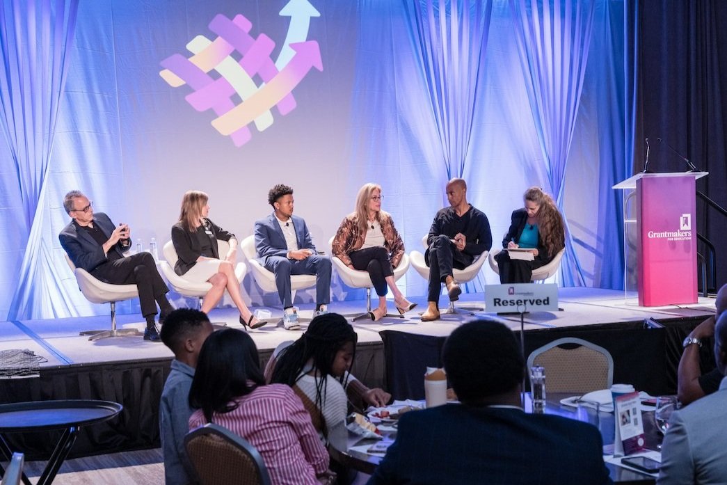
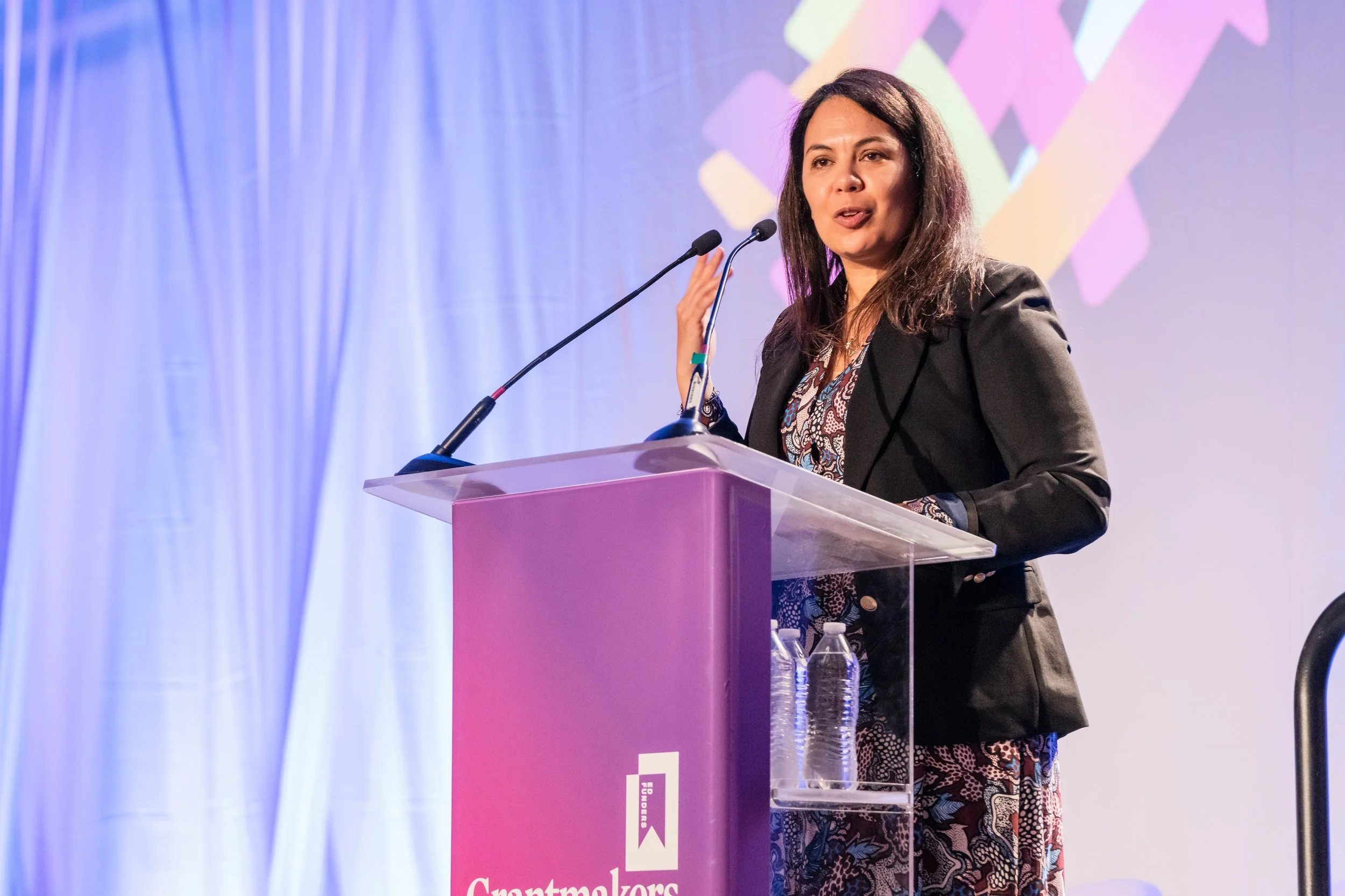
Challenge
Grantmakers for Education needed their Annual Conference to do more than convene people. With hundreds of funders, 80+ sessions, and a justice-centered theme, the challenge was creating a clear, cohesive experience that could turn big ideas about equity and learning into shared understanding and real momentum.
Solution
I helped shape a unifying narrative and visual direction that translated the conference theme—In Pursuit of Justice—into an accessible, human-centered experience. The approach focused on clarity, cultural context, and connection, ensuring the content moved smoothly from inspiration to practical application across sessions, formats, and audiences.
Outcomes
The conference delivered a cohesive, engaging experience for hundreds of grantmakers, helping complex ideas move from abstraction to action. Attendees left with shared language, clearer takeaways, and a stronger sense of how their work could support learners and communities in meaningful, actionable ways.
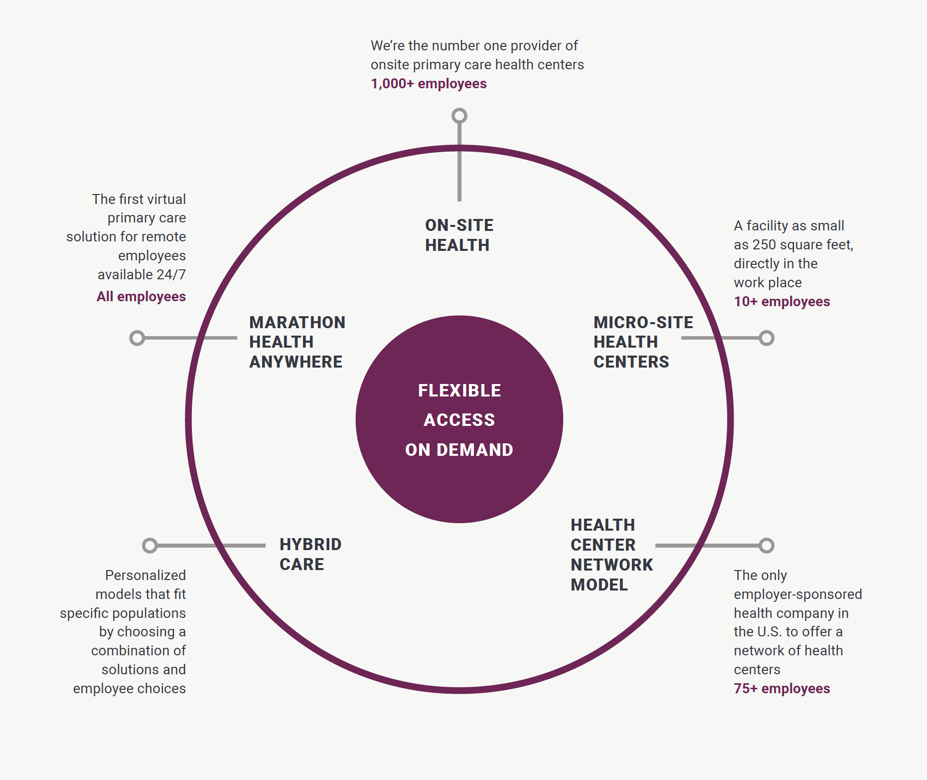
Challenge
Marathon Health needed a clear, compelling way to explain a holistic, preventive healthcare model to employer audiences—one that connected clinical philosophy to real-world outcomes like cost savings, access, and employee well-being.
Solution
I helped shape a design playbook that translated Marathon Health’s approach into an accessible, employer-focused narrative. The playbook emphasized preventive care, personalized wellness, and collaboration, clearly positioning onsite workplace health centers as a practical, empowering solution for organizations.
Outcomes
The playbook clarified Marathon Health’s value proposition, reinforced the benefits of accessible care and chronic disease reduction, and supported employer decision-making with tangible results—including $2.6 million in documented cost savings.
Work displayed here reflects projects undertaken in my professional capacity while employed by Langrand, a creative think tank. All trademarks, brand assets, and intellectual property rights remain the property of their respective owners. Any materials presented are for illustrative portfolio purposes only.
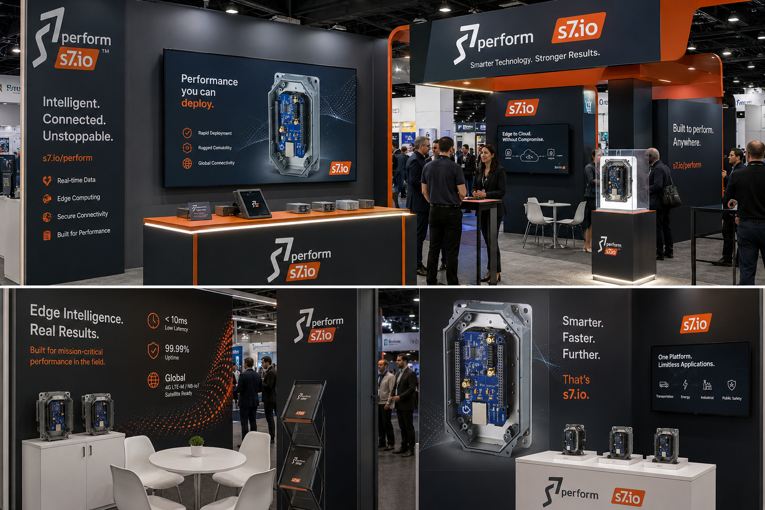
Challenge
S7 offered powerful, flexible IoT connectivity hardware—but its value was difficult to communicate beyond highly technical audiences. The challenge was translating an engineer-driven vision into a clear, usable experience that resonated with real users and supported adoption across use cases.
Solution
I synthesized a dense, technical manifesto into clear user personas, refined the user interface in close collaboration with the development team, and created a complete brand identity. The work aligned product, experience, and messaging around how users actually configure and deploy the technology.
Outcomes
The resulting identity and interface clarified OpenH.io’s mission, improved usability, and positioned the platform as an accessible, adaptable IoT solution—bridging the gap between technical capability and real-world application.
The research from Sanders was great, diving head down into products specifics and consumer mentality - both makers and industrial engineers. Very close collaboration with our product and web development teams, short timelines, and high pressure.
Oly Medlicott, business development
Challenge
As casino audiences skew younger, the industry faces a shift from traditional gaming toward full-scale entertainment experiences. While 21–35-year-olds now make up the highest frequency of visitors, most casino advertising hasn’t evolved to reflect how this generation plans, moves, and experiences a night out.
Solution
I developed an ad campaign concept rooted in cultural behavior—capturing the anticipation and energy of getting ready for a night on the town. The creative repositioned casinos as entertainment destinations, using dynamic, urban placements designed to meet audiences in motion.
Outcomes
The campaign strategy bet on aligning Wildhorse with younger, experience-driven consumers and leveraging high-visibility placements from both drive-by exposure and a 21% nationwide increase in public transportation ridership—modernizing the category’s presence and relevance.
Work displayed here reflects projects undertaken in my professional capacity while employed by Bradshaw Advertising. All trademarks, brand assets, and intellectual property rights remain the property of their respective owners. Any materials presented are for illustrative portfolio purposes only.
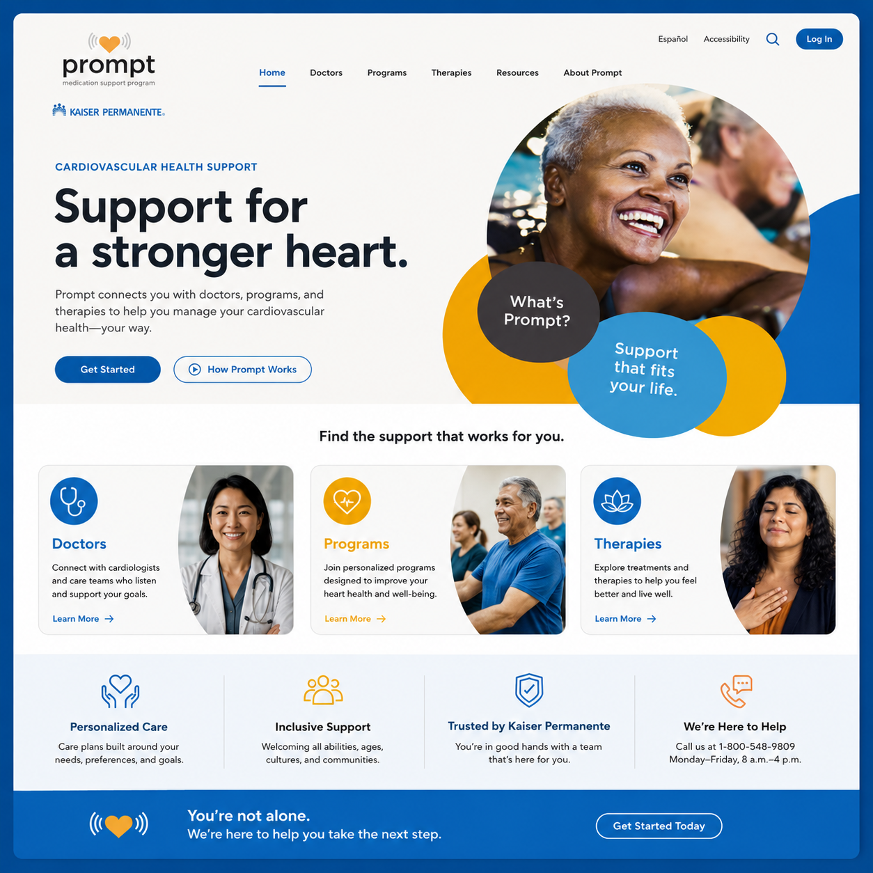
Challenge
Kaiser Permanente needed to engage high-risk patients across multiple regions with a new pilot program—many of whom were encountering the initiative for the first time. The challenge was building trust quickly while supporting existing care models and encouraging sustained patient adherence.
Solution
We created a fully branded national identity built around friendly expertise—approachable, credible, and reassuring. A clear question-and-response framework addressed patient concerns upfront, while photography highlighted attainable, active lifestyles to reinforce relevance and possibility. The system flexed across all outreach touchpoints to support consistent, clear communication.
Outcomes
Participants who received the branded reminder materials showed higher adherence and achieved a measurable 3.6 mg/dl greater reduction in cholesterol compared to those outside the pilot—demonstrating how thoughtful brand strategy can directly support better health outcomes.
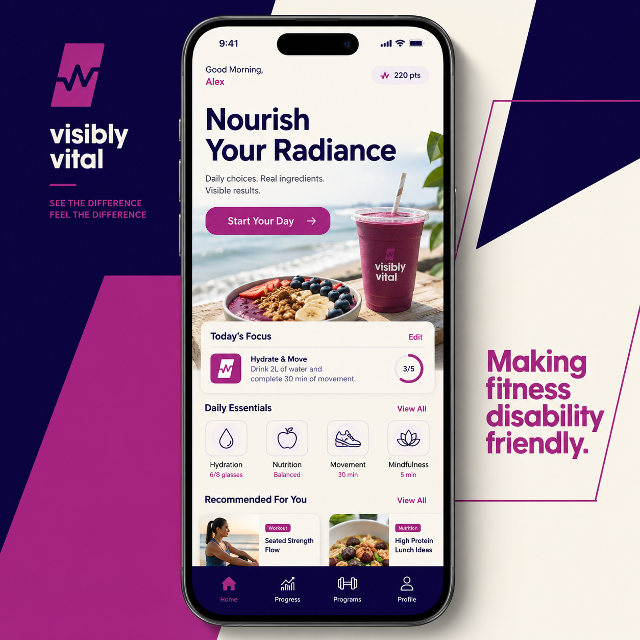
Visibly Vital is a conceptual wellness brand created to show what inclusive health could look like when every person is considered from the start. The project includes a cohesive brand identity, accessible mobile app experience, and social media campaign designed to encourage healthier lifestyles for people of all abilities. By reimagining fitness, nutrition, and mental wellness through a more inclusive lens, the brand demonstrates how thoughtful design can help remove barriers and create a stronger sense of belonging for underrepresented communities.
“An estimated 70-80% of all disabilities are invisible, which means the vast majority of people living with a disability show no outward physical signs”
Challenge
Peace Valley School needed a brand strong enough to launch a new, unconventional learning model while speaking to multiple audiences—students, families, community members, and potential investors. The identity also needed to clearly differentiate the school from other regional options and support future growth.
Solution
I led a collaborative strategy and branding effort with the founder and Board to clarify the school’s core philosophy: building self-sufficiency and supporting conscious choice through integrated learning. The resulting identity system balanced warmth and clarity with practical guidelines, ensuring consistency while allowing the brand to scale.
Outcomes
The branding helped accelerate early enrollment and played a pivotal role in securing $99K in investment returns—demonstrating how a clear, values-driven identity can drive both participation and financial support.
We worked with Sanders building the branding and messaging for Peace Valley School and couldn’t have hoped for a better team or results.
John Hunt, board of directors
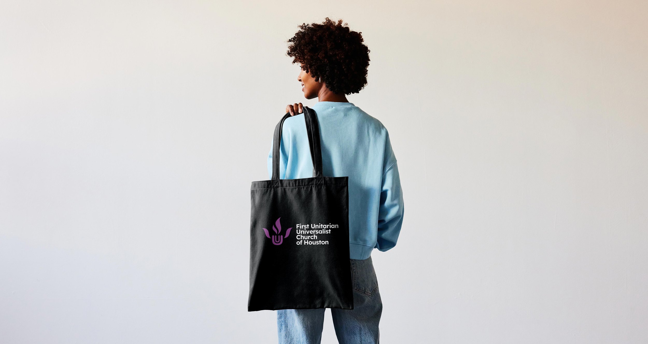
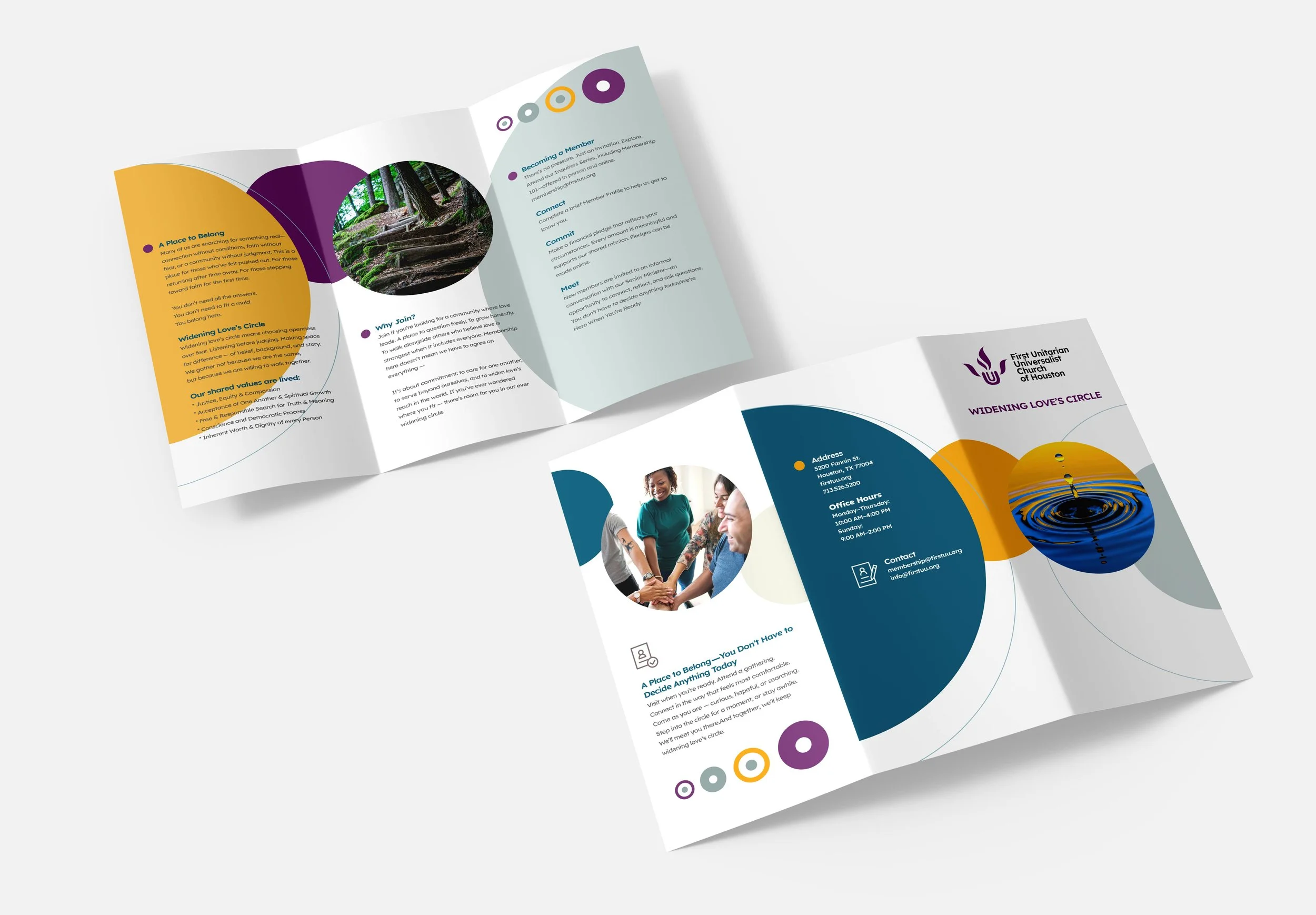
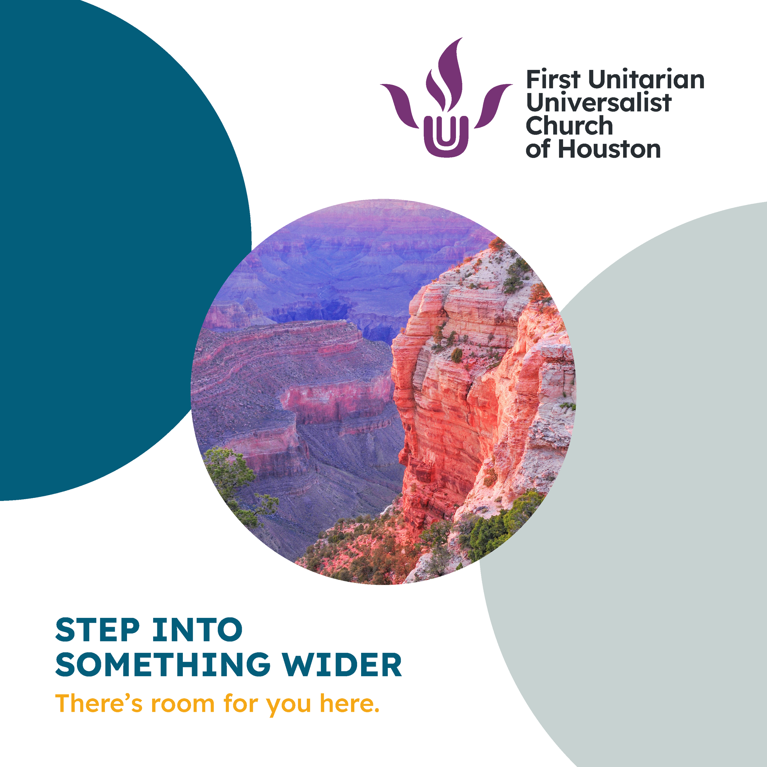
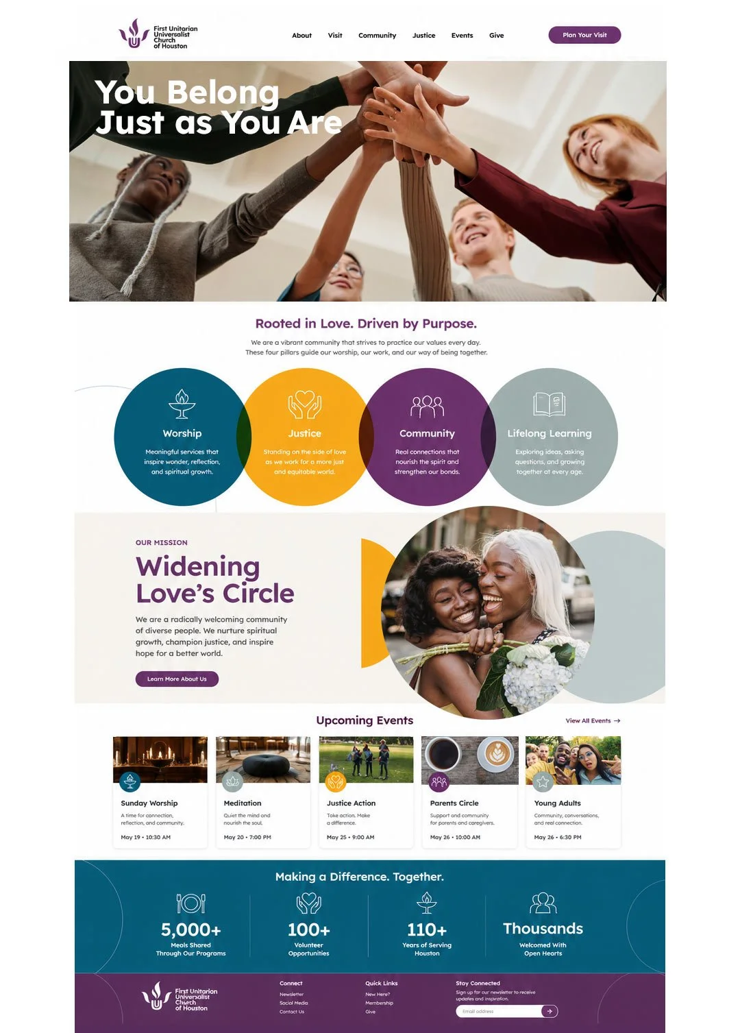
Challenge
The church’s identity had evolved piecemeal over time—generic visuals, inconsistent messaging, and disconnected materials created a fragmented presence. The result felt unclear and out of step with the church’s deeply welcoming spirit. The challenge was to articulate a brand that reflected the community’s true ethos: a place where people can arrive fully, explore faith openly, and belong without condition.
Solution
We developed a cohesive identity rooted in radical welcome. Language, imagery, and design were shaped around a simple idea: faith grows by making room. The brand voice speaks with warmth, humility, and invitation—creating space for the curious, the returning, and those who have never quite felt they fit. A flexible visual system and unified voice brought clarity and consistency across every touchpoint.
Outcomes
The new identity gives the church a clear and confident presence—one that reflects its values of inclusion, care, and social justice. Communications now feel unified, authentic, and inviting, helping members and newcomers alike recognize the church for what it truly is: a place where all of you is welcome, just as you are.
#BrandStory #MarketingInsights #GrowthMarketing
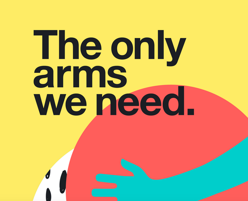
In December 2019, I received a special invitation to submit work for the International Art and Design Exhibition in Eskişehir, Turkey, co-sponsored by INSEA and GÖRSED, and hosted by Anadolu University.
Only 15 artists and designers outside of Turkey were invited to participate, and my work was selected for inclusion in the final exhibition. The piece explored the importance of diplomacy, empathy, and human connection in an increasingly divided world—reflecting the belief that the human arms we embrace one another with are ultimately more powerful than the military arms we use against each other.
Art Direction & Design:
Sanders Anderson, M.Sc.
Challenge
Contractors Association Truckee Tahoe (CATT) needed a clear, compelling marketing message to retain current members and attract new ones, while establishing a presence in South Lake Tahoe. The challenge was delivering this message efficiently across both digital and video channels for a first-time campaign.
Solution
As the Digital Strategy Lead, I coordinated with key stakeholders and the Origami Rocket video team to develop a branded video. I served as the primary marketing contact, guiding planning sessions, team calls, and in-person meetings to ensure content had on-target messaging.
Outcomes
The campaign successfully introduced CATT’s first marketing video content supporting member retention and growth. Combined with the digital strategy, it contributed to a 5% increase in membership and facilitated the association’s expansion into South Lake Tahoe.
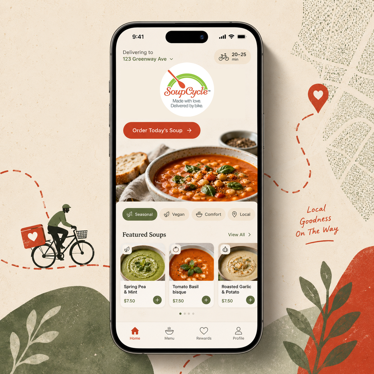
Challenge
SoupCycle had built a loyal following around scratch-made meals using organic, locally sourced ingredients. As the company prepared to expand beyond Portland, they needed a brand voice and identity that could grow with them—without losing the authenticity that made them beloved.
Solution
I developed a scalable brand system that clarified SoupCycle’s voice, personality, and core promise. This included a flexible identity framework, key brand ingredients, and a succinct tagline that distilled what made the company special—making the brand easy to apply across new markets and touchpoints.
Outcomes
The rebrand gave SoupCycle the clarity and confidence to expand operations from two cities to three, while preserving its local, human feel and strengthening recognition as the brand grew.
Challenge
Vaccine resistance is often driven by distrust, fatigue, and a sense of powerlessness—especially toward institutional or clinical messaging. The challenge was finding a way to reach hesitant audiences without triggering skepticism or immediate disengagement.
Solution
This Pro VAX Instagram campaign was designed to interrupt assumptions rather than argue facts. Using a deliberately non-clinical, culturally familiar visual language, the campaign invited reflection and action—encouraging people to reconsider their options through tone, relatability, and subtle persuasion.
Outcomes
The campaign demonstrated how accessible, culturally aware creative can open space for dialogue and reflection—showing that even small, self-initiated efforts can counter despair by turning skills into action and influence.